So, we’ve spent an awful lot of money. Was it worth it, and will we ever make that money back?
Well, the house has been totally transformed.
Before it was cold and draughty. There were problems with mould, where moisture condensed on cold walls. On a cold day, an hour after the heating went off I’d need to put on my fleece.
It’s now cosy and warm 24 hours a day. It feels fresh and healthy, and that mould has been eradicated.
Net carbon emissions have been massively reduced, and we’re saving thousands of pounds every year.
Carbon Emissions
This graph shows energy use for the house over the last few years. We moved in in Oct 2012.
See if you can spot where we switched heating systems from gas to renewable/electric.

This shows that since February 2013 our electricity use is high in winter when the heat pump is running, but we use very little in summer, when the heating is off and most of our hot water is heated by solar thermal.
Counter to that, our solar panels generate lots of electricity in summer, when the days are long and bright, but far less in the depths of winter.
So, in summer we generate more than we consume, but in winter it’s the other way round. Over the course of a whole year we generate about 90% of the amount of electricity that we consume.
It’s clear that our overall energy use dropped massively when we switched heating system. However, what I’m really interested in is reducing greenhouse gas emissions, and here the above graph could be misleading. Although gas use looked very high, the emissions (and cost) of mains electricity is much higher – nearly 3 times that of gas. This is because fossil fuel power stations are so inefficient.
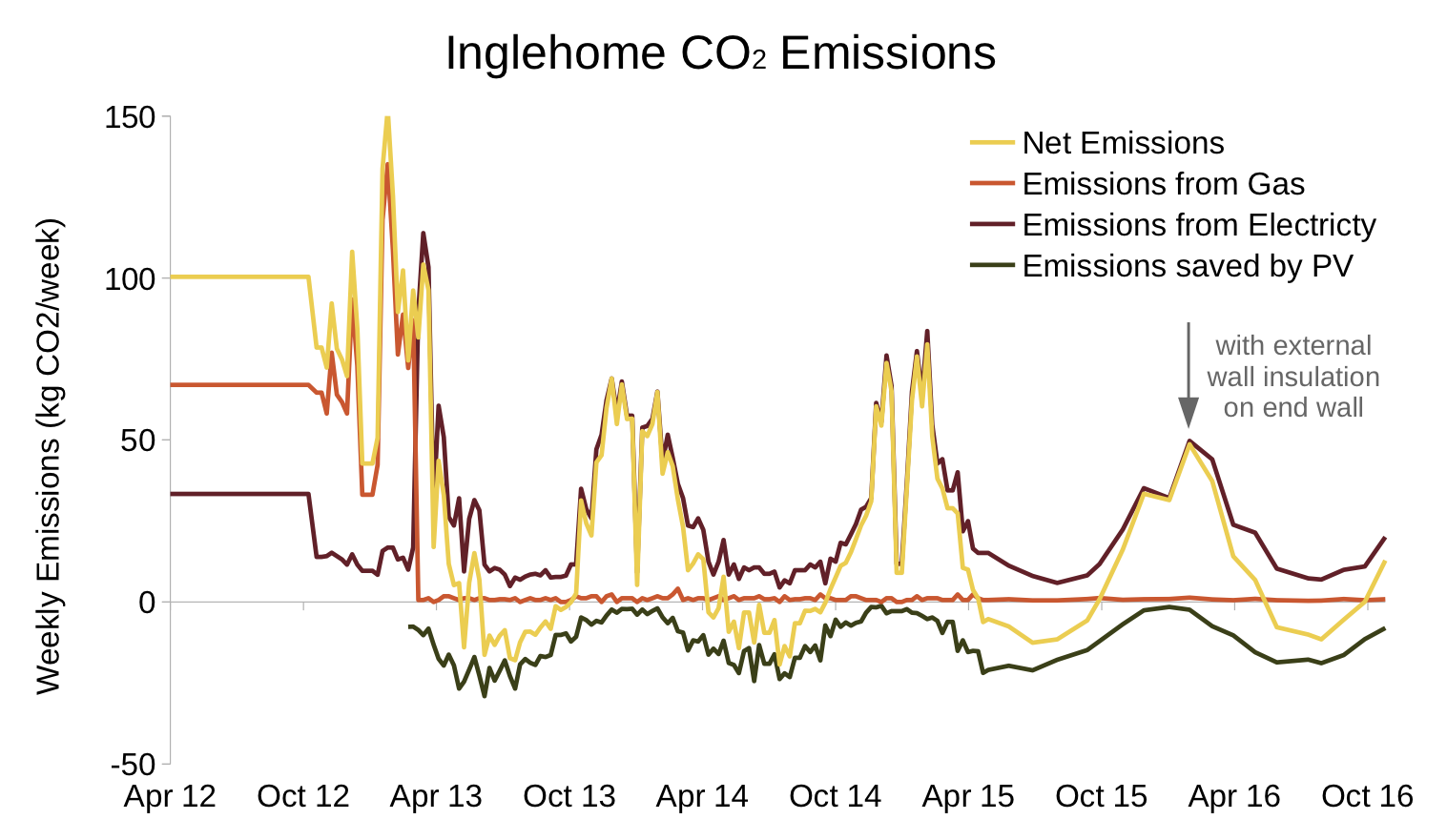
The important line here is yellow, ‘Net Emissions’, the sum of the other lines.
It shows that our emissions in winter are now significantly lower than before.
But more than that – in the Spring, when we start generating much more than we consume, the yellow line dips below zero. Our net emissions go negative.
So, before the house emitted over 5 tonnes of CO2 a year. The the net emissions now are less than 3/4 tonne – a 90% saving.
Grid Emissions

The amount of CO2 emitted by the grid varies throughout the day, and is falling every year as more renewables come on stream. You can see what it is right now here.
There’s a more detailed Gridwatch here.
My graph uses a standard grid emission figure for use in carbon accounting as published by DEFRA/DECC here. The figure for 2013 was 0.445kgCO2e/kWh.
Offsetting
Offsetting emissions can be dodgy. I don’t think it’s ok, for example, to jump on a transatlantic flight just because you pay someone in Africa to plant a few trees for you.
The solar panels on our roof do not absorb CO2, but the surplus electricity they generate is exported, and offsets supply from the grid.
So I’ve offset the CO2 saved by the exported electricity compared to mains electricity. i.e. the CO2 that would have been emitted had that electricity been supplied by the grid.
Without a smart meter the amount exported can only be estimated. The standard estimate is 50% (used to calculate the export tariff paid), which is what I’ve used here. i.e. of the electricity generated by our solar panels we use half ourselves and export the other half. This is on the cautious side – we use so little electricity in summer I’m sure the actual proportion exported is much higher, so the savings likely to be greater than shown in the above graph.